18+ Content Warning

By clicking Enter, you confirm you are 18 years of age or older and agree to comply with all applicable local, state, and federal laws.

Notice: Any content or member activity - including anything you may buy, sell, transfer, or discuss - must comply with current and upcoming laws.

Members are encouraged to stay informed: California Firearm Laws: 2026 Outlook & 2025 Recap . Responsibility for compliance rests solely with the individual member.

  • Welcome

    Welcome to CAguns

    Join California’s gun owner community. Create a free account to join discussions and explore member features.

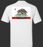
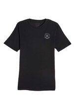
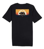
CAguns Shirt Mockups

What do you think of the new logo?

  • Looks good

    Votes: 25 64.1%
  • Needs work!

    Votes: 12 30.8%
  • Other

    Votes: 2 5.1%

  • Total voters
    39
It’s mainly for people who want to be more discreet.

It’s easier for me to do in batches vs trying hold inventory.

Discretion is an important consideration for some of us. I NEVER wear a gun or knife shirt if I'm packin'. As you might imagine, it's not often that I get to wear a gun/knife shirt.

Thanks for going through the effort to make shirts. Be careful not to let it become your full-time job... it would take away from running this forum!!!!!!
 
I'm a sucker for typography; +1 for the original version.

I get how some may be weary of wearing something that says "guns" in public, especially if you live in a fairly 2A unfriendly city/county. I have no qualms with it, in fact, I equate it to *almost* when I see people rock NRA hats, thin blue line gear, or even a Magpul hoodie. I guess those are more for IYKYK type of crowds...
 
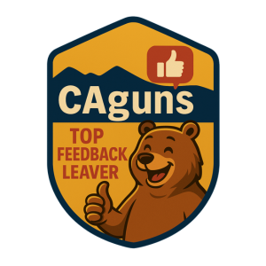
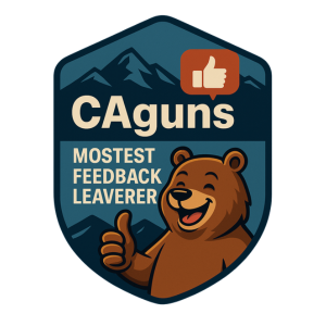
I like em both but I'm a fan of the Bear one personally. I always thought that was a cool animal to have on our flag.
 
CA's bad guys can't read so I'm good either way.

Good stuff. Thanks for all the hard work.
 
Bear logo FTW!!

New logo looks a bit '4imprint' to me?

I don't wear anything with 'gun words' on it, but no gun words makes it tough if you're trying to raise brand awareness for a forum call 'CAGUNS' haha!!

Thanks for all the hard work!!
 
The topo map under the V2 logo confused me. Not sure where it is or why it's there.
 
V1, shirt doesn’t really promote anything if it doesn’t say the site on it so think it needs to be on there.
 
It needs the bear with the umbrella sticking out of its ass.
 
The topo map under the V2 logo confused me. Not sure where it is or why it's there.
It’s to break up the plain background. San Andreas fault.
 
Updates I think we’re getting close to our initial.. we’ll likely go with this one..

123_1.jpeg123_1.jpeg
 
The 'shield' logo need a little work but overall you could roll with it right now and it wouldn't be terrible. I like the color schemes.

The font on the bear logo needs to be changed. Something thicker and with more authority to maintain legibility at different scales. The bear logo itself looks decent.
 
The 'shield' logo need a little work but overall you could roll with it right now and it wouldn't be terrible. I like the color schemes.

The font on the bear logo needs to be changed. Something thicker and with more authority to maintain legibility at different scales. The bear logo itself looks decent.
Thanks for the note. I made similar comments that are being adjusted. The shield will likely get some more work done but this is a v1 shirt offering. Our next ones should be a bit better as we iron out things. I'm thinking we'll do some drops every so often. The roughness adds to the character that the site is still young. Next week its officially 1 year, March 20!

I'm not so good at knowing what Iwant for shirt/logo design, BUT i can design scalable systems to billions of requests per minute. It's useless with shirts though. 🥲
 
Thanks for the note. I made similar comments that are being adjusted. The shield will likely get some more work done but this is a v1 shirt offering. Our next ones should be a bit better as we iron out things. I'm thinking we'll do some drops every so often. The roughness adds to the character that the site is still young. Next week its officially 1 year, March 20!

I'm not so good at knowing what Iwant for shirt/logo design, BUT i can design scalable systems to billions of requests per minute. It's useless with shirts though. 🥲
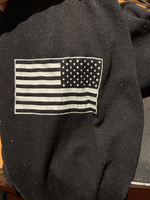
I think we need a flag on the sleeve. USA white on black similar would look pretty nice. That would be the icing on the cake.
 

Attachments

  • tempImageaUr16t.png
    tempImageaUr16t.png
    410.3 KB · Views: 2
Last edited:
We could also really use a full size variant(hoodie). A large majority of cagunners are 50-100LB overweight and can't wear t-shirts in public.
 
Saw this somewhere else. Great slogan for the back of the t-shirt.

2025 California
is worse than
1775 Boston
 
Back
Top Bottom